This is an adaptation of the presentation that I use during the meetings for this theme, so it’s a bit bare, mostly reference images with a short explanation.
In this post I’ll focus on one of the basic elements of a photograph: The Frame – its dynamics, formats, common alterations and usual ways of positioning the subject. The understanding of these basic concepts will help the keen photographers to further improve their photography skills and the quality of the images they create.
First, what is the frame?
The frame is where the image is recorded. In the old days of film, it was the negative. A common 35mm negative would give us 36 exposures, or 36 frames. In the digital era, the frame is the sensor. Every digital camera uses a sensor to capture the light and record the image – just like the film. The sensor is an electronic component, that can have many different sizes, depending upon the equipment. Professional digital cameras are equipped with sensors measuring 36x24mm (35mm) or aprox 23x16mm (APS-C). Modern cellular and tablets uses sensors measuring only aprox 6x5mm.
So, in simple terms, the frame is the photographer’s canvas. It’s a rectangle board that we use to create our images.
The Frame’s Formats
- The Human Sight
- 3:2 and/or 4:3
- Panoramas
- Variations
- Square
The Human Sight
According to several studies about the correlation between photography and the human sight, it’s a consensus that the equipment combination that is closer to the way we see, is a 35mm camera (Full Frame cameras as they’re known nowadays), using a 42mm lens, set with an f8 aperture in the horizontal position. The field of view of this equipment combination and settings, gives you roughly the same field of view of the human sight that is clear and largely in focus. I say “clear and largely in focus” because the field of view of the human sight is much more ample/wide than that. The problem is that our periphery view if not in focus, but when something that calls our attention happens in our periphery view, we instinctively turn in that direction “recomposing” our main field of view.
Someone can ask about other considerations, like our stereoscope vision that gives us the ability to interpret the depth of the scene, which is not possible with a 2D image. But it is! We can create a sense of depth in a 2D image by expertly using texture and contrast, especially with a wide-angle lens, but also using a ‘normal’ lens like the 42mm. To be a ‘normal’ lens, means that it’s in the middle of the scale, between wide-angle and telephoto lenses.
But I’m digressing and wandering too far ahead of the current theme: The Frame!
3:2 and/or 4:3 Formats
3:2 and 4:3 are the most common frame’s proportions. A film negative – and incidentally the Full-Frame digital sensor – measures 36x24mm, hence a 3:2 proportion. APS-C sensors (or cropped sensors as they’re also known) measures 23.6×15.7mm, also a 3:2 proportion.
Some cameras that use smaller sensors may have a 4:3 proportion. The same goes for some cameras with bigger sensors, known as medium formats. Large format cameras use unique films and/or sensors with a variety of proportions.
A 3:2 landscape used to be the most common format of a photograph. I’m not sure, but I reckon that nowadays this honour falls to the narrow and tall portrait image taken with a cellular. Photography is a continuous evolving art.
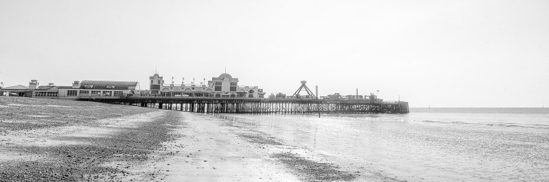
Panoramas
Panoramas are very wide images. They can be horizontal or vertical and they can have a variety or proportions. The most common is the 16:9 format, as is the setting usually offered by digital cameras and mobile equipment.
Variations
The obvious variation is the orientation of the frame, it can be horizontal or vertical.
But there are no rules about it, you can create an image whichever way you want it, your imagination is the limit!
Square
A square was once a very popular format among photography professionals, because of the equipment they used. TLR’s and Hasselblads were the preferred equipment for photo-journalism and editorial photography respectively, both models were medium format cameras that required 6x6cm film, a square format.
The square format is once again a popular format in photography, this time due to the popularity of a social media tool. Does anyone know which social media I’m talking about? Just a hint: they come in rows of 3s!
The Frame’s Dynamics
- The Frame
- Alignment
- Diagonal Tension
- Abstraction by Sectioning
The Frame
The frame is – in most cases – a rectangle canvas where we – photographers – create our images. This format allows many possibilities, but it also creates some challenges. One of them are the corners, usually far from the main subject and, incidentally, far from the focus of the photographer during the composition. Unlike a painting where the painter needs to deliberately paint something so that something shows up in the final painting; a photography is a capture of a scene that already exists. The photographer’s job is to compose the image using the frame to capture only what he wants to show in the final image. But if he focus solely on the main subject and do not pay attention to the fringes of the frame, he can inadvertently include some undesired elements.

Other aspect of the frame is that due to its common format, it’s easy for the observer to initially direct his attention to the centre of the frame. This instinctive reaction creates an opportunity for the photographer. By composing – or designing his composition – in an unexpected way, he can create another level of interest to the image.
Alignment
There is nothing worst than a sunset tipping to the side! A house or building inclined like the Tower of Piza, what a shame! Yes, you can deliberately rotate a composition to create interest. The key word here is “deliberately”. Be careful with alignment, this is the bare minimum to create half decent images. As long as photography cares, the earth is flat, so make sure that the horizon is properly horizontal. Unless you’re photographing the aforementioned Florentine tower, make sure that the buildings are perfectly vertical. Yes, I know, I have OCD – but I’m getting better with age, believe me! Or not…

But in some circumstances, alignment can be a trick aspect of the image. There are some optical limitations to the equipment. For now is sufficient to say that lenses are circular components and the sensor is a rectangle. Almost all lenses will introduce some measure of distortion towards the fringes of the frame, specially the wide-angle lenses.
There are two options to correct the fringe distortion. The first is the obvious one, which is to crop the image eliminating all the distorted area, keeping only the centre of the frame. The second is to use a software to correct the distortion digitally, like Adobe Lightroom or Adobe Photoshop.
Also, images like the “Lemington House” above, or any other image from my series “Hard Lines”, wouldn’t be possible without some post-processing*. When you direct your camera to a subject higher (or lower) than your position, you introduce distortion due to the different distances between the top and the bottom of the subject to the camera. To correct this type of distortion the use of post-processing software is most certainly required.
* Before anyone start shouting “This is not true!!!” Let me remark that it’s indeed possible to capture a distortion free image using large format folding cameras – or using tilt-shift lenses that function in a similar way of the large format folding cameras. We’re way out of focus here, but to quench your thirst of knowledge; large format folding cameras make use of “bellows” to connect the lens to the film panel. Bellows are flexible and allows to direct the front element of the lens towards the subject keeping the panel of the film (or sensor) aligned to the subject, thus eliminating the distortion introduced. This is a (VERY) over simplified explanation; just a little bit of trivia for those with interest in architecture photography.
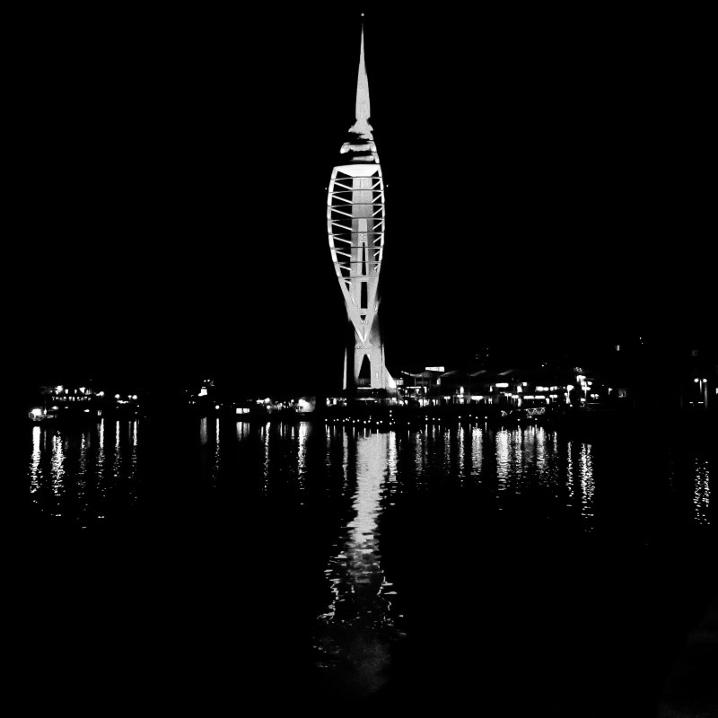
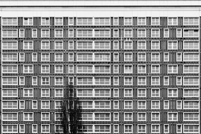
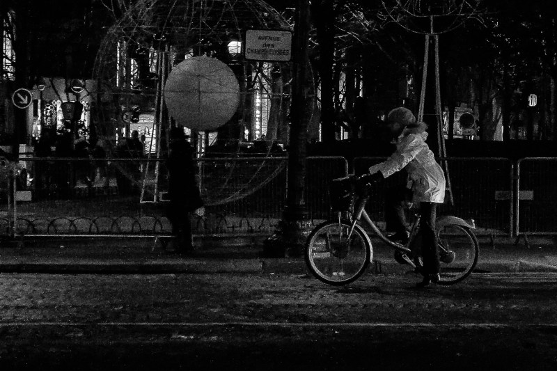
Diagonal Tension
Whilst perfectly aligned lines transmits a sense of order and tranquillity, diagonal lines introduces some tension to the composition. Diagonal lines can direct the sight of the observer, introduce movement, a sense of chaos, and many other possibilities.

In the image above I could have composed it aligning the row of tables either vertically or horizontally, but by composing it diagonally I was able to transmit a bit of the chaos inherent to a large university’s cafeteria. And in the image below I was able to merge the branches of the tree with the horizontal lines between the building’s floors, thus creating a sense of movement where there is none. The movement is in the direction of the sight of the observer.
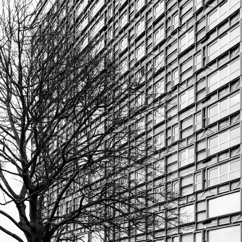
WARNING!! Diagonal lines are not an excuse to take skewed photos! Please notice that the vertical lines in both images above are correctly aligned.
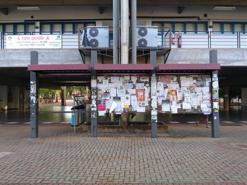
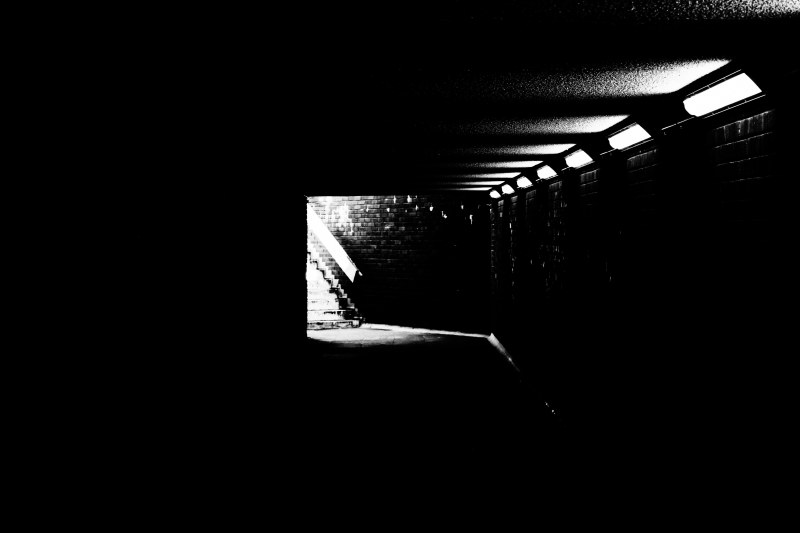
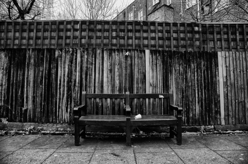
Abstraction by Sectioning
This is a trick concept. The basic idea is to focus the observer on a smaller part of the frame by creating a negative space. What is a negative space? It’s an area where there are no elements, recognizable or not, basically a null area. How can we create a negative space within the frame? Depend upon the subject and the way we compose the image. We can use light, darkness, solid colours, depth of field*, and a myriad of other ways.
* “Depth of Field” is a concept based on the use of aperture. It’s a theme in itself, we will leave it for another opportunity. Stay tuned!
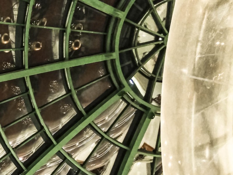
In the image above I used an element of the mall’s Christmas decoration to show only half of the ceiling’s structure. To be honest, it’s not a particularly good image; it’s here just as an example of the technique. But the image below is indeed a very good image, if I may say so! In this image I make use of darkness to focus on the light at the end of the under pathway.
Possible Alterations of the Frame
- Stitching (Merging)
- Cropping
Stitching
In the old days of photography, when the post processing occurred through manipulation of physical negatives, to create a larger scene from several smaller photos, you had to stitch the negatives together. Really, I don’t know how the lab technicians used to do it – I don’t think that they actually stitched the negatives! Nowadays, in the digital era, the term “merge” is more common, because you merge the digital images (computer files) together to create a larger image (incidentally, a larger file).

The image above shows the result of the merging process of several shots, perhaps 6 or 7 – I don’t quite recall how many, and I’m not feeling like opening Lightroom to check… Notice that the final image is going up from left to right. That happens because at that time I didn’t have the appropriate tripod head to create horizontal panoramas. I simply turned my camera to portrait mode and rotated it using a regular tripod head. By turning the camera to portrait mode in a regular tripod head, you take it of centre, and when you rotate it, you shoot each image from a slightly different perspective. That’s what introduces the “Ladder Effect”. The image below shows the final result after cropping out the blank space.

Of course panoramas can be horizontally or vertically orientated. Here is an example of a vertical panorama.
To create the final image I shot from the top of the Arc of Triumph using a 450mm telephoto lens. This image is the result of the merging process of 18 different images, 3 columns wide and 6 rows tall. “Why!?” You may be asking. At that time, my digital camera had a resolution of only 11M pixels. I wanted to create something different, but it’s hard to create something different out of the most photographed landmark on earth. So I decided to make it big, in this case, large. But to make it large with only 11M pixels available is not possible. Hence, the merging of 18 11M pixels images, resulting in a 180M pixels final image.
The image above can be printed up to 180cm tall. It’s being sold in a Limited Edition by a specialized store.
Cropping
Cropping is the easiest procedure you can do to alter the frame. You just crop stuff out leaving only what you want. For example, I have a series called “Empty Spaces”. In this series I have images of – yes, you got it – empty spaces! Like the image below.
But the original image is not quite empty…
Did you really think that I managed to photograph an empty gallery in the Louvre during the visiting hours!? Come on!
Positioning the Subject
- Filling the Frame
- Using Focus Points
- Splitting the Frame
- Horizon Line
- Frames within the Frame
Filling the Frame
To fill the frame is simply composing in a way that the subject fills most of the available space in the frame.
Using Focus Points
Focus points are areas in the frame that are recognized as aesthetically efficient. Basic concepts of graphic design. In photography, the most known/used concept is the “Rule of Thirds”. To use the rule of thirds you must split the frame in nine equal parts by tracing 2 equidistant lines horizontally and another 2 vertically. Then you just position the subject in one of the intersections of those imaginary lines. Many modern digital cameras allows you to see the images in the LCD, to help you when composing the shot. And, of course, the middle of the frame is the most obvious focus point.


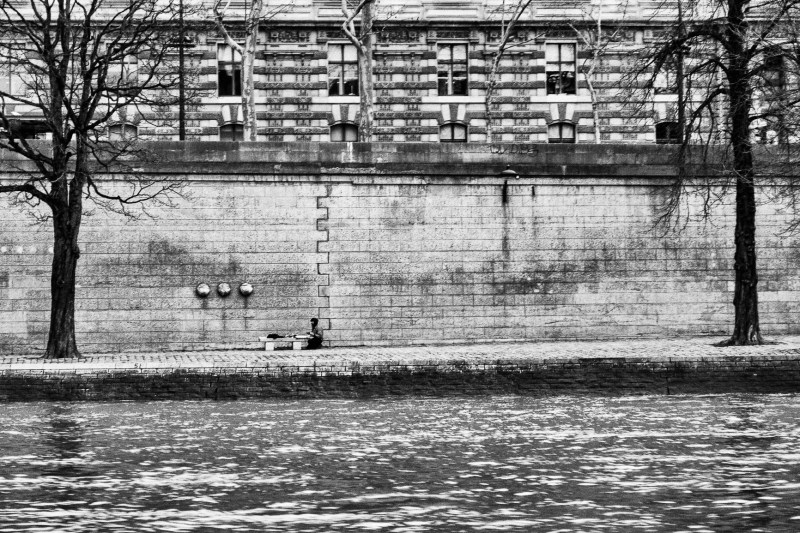
Splitting the Frame
Splitting the frame is when you use graphic elements to split the frame in different parts. It can be elements of the composition, like a wall or some other physical structure, or visual effects, like light and darkness.
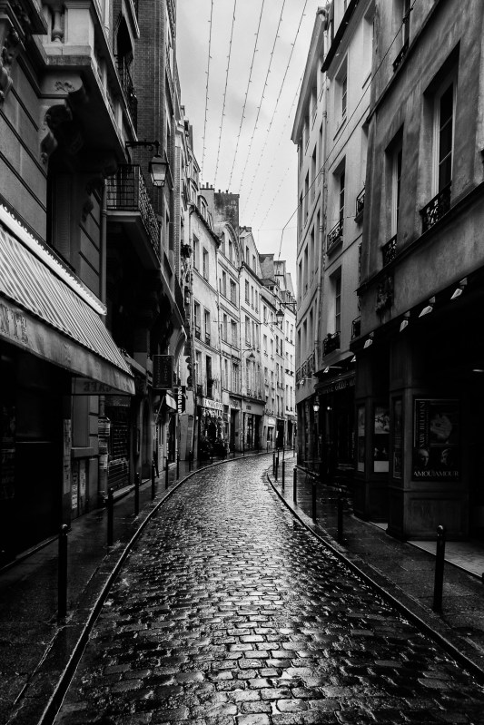
In the image above I use the light from the sky and reflected on the street to create a symmetric composition.
Again, same idea, but now the symmetry is horizontal.
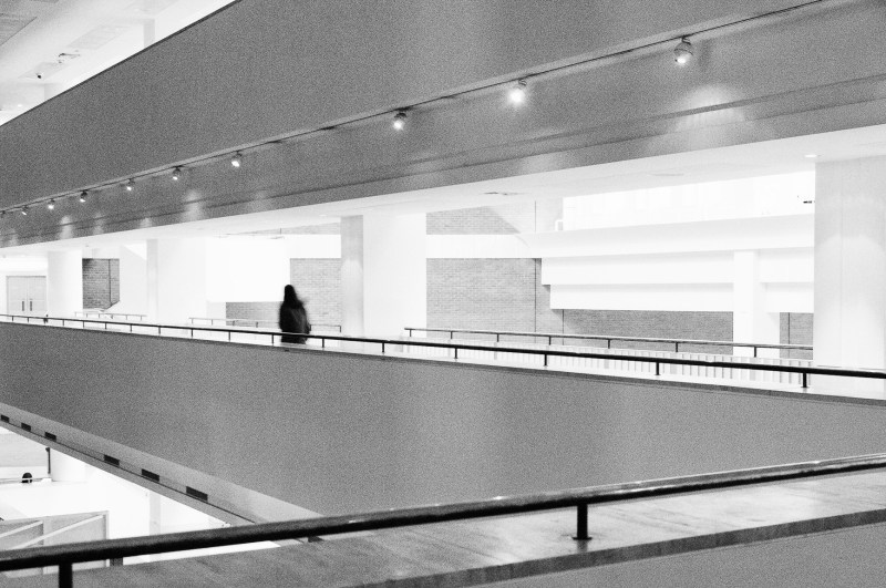
In this image I’m using the light reflected over the handrail to separate the higher ground from the street below. It’s subtle, but most of the time subtle details add a lot of interest to a photograph.
The Horizon Line
“The earth is flat, hence the horizon line is flat, and horizontal!” Jokes aside, unless you are photographing from the International Space Station – or from a very high standing point using a wide-angle lens – you will capture a flat scene, so it’s logical that the horizon line should be flat and horizontal. Depending of the lens you’re using it can be distorted and you can incorporate the distortion effect into your final image or not, it’s your choice. What you CAN’T do is to take a shot with camera tipping to side because you’ve balance issues – or you’re just sloppy – and leave it at that. It’s very easy to correct an image using a post-processing software to rotate it to whichever side you need, and to correct any lens distortions if you so desire.

There is nothing more “horizon(ish)” than a great body of water, like a large reservoir, river or the sea. The surface of the water is always flat, unless of course, you’re in the middle of a storm, but than you will be very brave photographer and not overly concerned about things like perfectly alignment…
The image of the building above is a classic example of lens distortion that was corrected in post-processing. The shot was taken near the building using a wide-angle lens and the distortion is a given in this case, but the final image do not show any remarkable distortions, so it is safe to assume that it was corrected in post-processing. Although, if you pay close attention to the bottom of the building, you will notice a slightly distortion, unlike to the top, which is perfectly flat. Worry not! I’ll fix it in a jiff!
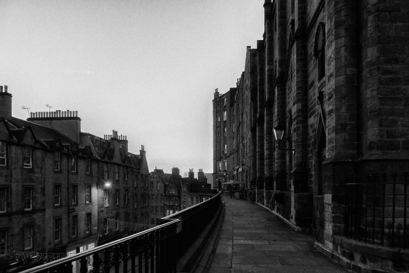
Where is the horizon line in the photograph above!? It’s implicit. It’s a trick image to get the horizon line right, with the series of small and irregular hills and no horizon in sight. You need to look for known elements in the image to use as reference points, like buildings, tall and straight trees, etc. And being extra careful when taking the shot, like using a tripod if possible.
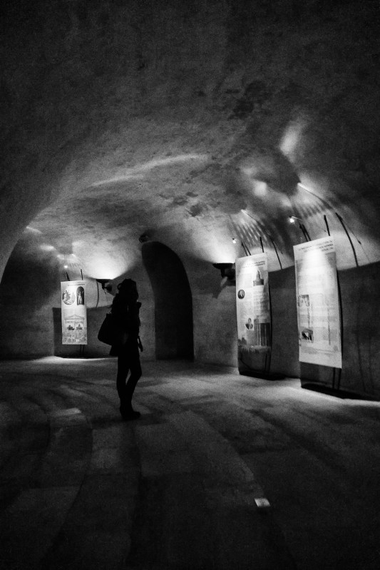
“Now you’re just taking the mick! An indoor shot and taken from an angle! Where is the horizon in there?” Again, it’s implicit, and you must use known elements to use as reference, in this case the columns. They are perfectly aligned to the vertical.
Frames Within the Frame
Although the word “Frame” appears twice in this composition technique denomination, it’s not overly related to the frame as we’re discussing right now. But I choose to include it in here regardless. Again, the name of this technique pretty much describes it very accurately. You look for elements that will act as a frame to the main subject, creating a frame withing the frame.
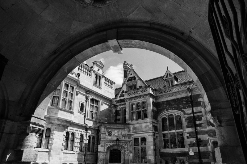
In the image above the inner frame is pretty obvious, the arc of the passage. And in the image below is more subtle, the two trees on each side of the image.
Discussing “The Frame” – a simple rectangle – seems to be a waste of time at a first glance, but it’s my hope that start talking about photography from the very basic will make you start thinking more about the act of photographing and that will lead you to be more mindful of what kind of images you want to capture, how you you want to present them.
Previsualization of the final image is a powerful tool for the successful photographer, but it’s a hard skill, acquired only after extensive study of photography techniques and lots of practice. Knowing your “Canvas” is the first step in this direction.
Carlos Alexandre Pereira
Urban explorer, travel and architectural photographer. Film and digital user, preferably B&W. Online/digital writer and publisher. Photography educator. Fine art prints available in limited editions.

